
If there’s anything that captures the concept of “spectacle” famously theorized by Guy Debord in his 1967 text “The Society of the Spectacle,” it’s social media, followed closely by sporting events. “The decline of being into having, and having into merely appearing” constitutes the society of the spectacle, wrote Debord, who then aptly declared that commodity has colonized society. It’s a bit obvious for me to say that Instagram represents the manifestation of Debord’s words, but what isn’t obvious is the nuanced way that Marisa Kriangwiwat Holmes blends these concepts into her photographs, disorienting the viewer.
Advertisements. Instagram grids. A race track. In our conversation, Kriangwiwat Holmes points out that in terms of visual literacy, as a culture we’re best at reading advertisements. She uses the language of advertisements—the colours, composition, and position on a sign—as a framework for her art practice. The result is a dystopian jest, images that look like advertisements but only reflect society back to us, articulating the spectacle. Kriangwiwat Holmes’s work is dizzyingly meta: a sign that’s not selling anything, but then again, maybe it is—because isn’t art also selling us something, if only an idea?
Sports are their own spectacle—a distraction in the form of entertainment, averting the public’s eyes from atrocities and politics. As the philosopher Noam Chomsky said: “One of the functions that things like professional sports play, in our society and others, is to offer an area to deflect people's attention from things that matter, so that the people in power can do what matters without public interference.” Cultural theorist Paul Virilio also mapped out the role of sports as spectacle and its relationship to images in his 1980 text “The Aesthetics of Disappearance,” where he wrote that the spectacle of sport is so accelerated that the viewer relies on the big screen to know where to look—our years of watching television informs our understanding of the game, even when watching live. Kriangwiwat Holmes’s experience working as a photographer at a racetrack nicely tracks with Virilio’s thesis, her camera guiding us, showing us how to look, how to understand the spectacle.
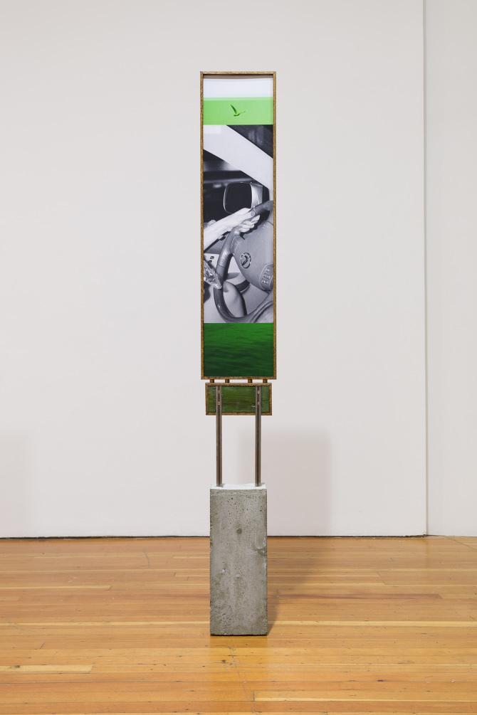
Superficial balms, such as social media feeds and Super Bowls, distract us from impending doom (nuclear war, climate crisis, fascism etc). Kriangwiwat Holmes’s work draws the viewer in with its visual similarity to the images we’re most acquainted with, and then pulls the rug out from under us, the visual text so much more complex than its false counterparts. Her images include visual slang. For example, a series of Kriangwiwat Holmes’s photographs feature her dog, a prevalent trope on social media. #cute #puppy. But her images feel unsettling in a subtle way, not unlike Goya’s drowning dog. The sculptural frame adds to the disorientation that the subject, lit by a strobe light, already established. The twisted piece of iron splicing the photograph in half makes it appear as if the running dog was caged in—a racehorse jostled by it’s dominating jockey!
Kriangwiwat Holmes was recently awarded the Lind Emerging Artist Prize, and is working toward a corresponding show at the Polygon in Vancouver. We talked about her experience as a recent graduate of Emily Carr, working in sculpture, and the nature of the image (#barthes).
I'm really [interested in how] photography becomes this form of communication without being written language, when you can have shared codes with wiggle room for interpretation.
It seems like the exhibitions you do are very site-specific. How do you make a show specific to the gallery space, or the exhibition that you have in mind? I’m thinking about SIBLING in Toronto or Calaboose in Montreal, which are very unusual spaces.
I loved Calaboose and SIBLING. I like showing in spaces like that. They are both more like project spaces run by peers. I feel comfortable. I have the wiggle room to make the images I want to make. I feel considerate of where I am, and the style of the space. Calaboose was specific, like a residency. They let me use their brand new space for about a month, and I used it as a studio. Then I went there everyday and made that work there. Two of the images were brought from Vancouver, and three of them were made in Montreal. So that really felt like a little Montreal residency. On a daily basis, by the end of it, I was biking from my sublet all the way down to the canal. Calaboose is right next to Rona; I got my hands on a chop saw and some tools. [I spent] the first few weeks tinkering away, and the last two working on the show. I think that was the first time I did plywood mounting. I was wrestling with that when I first did that. And the rest felt like Sunday hobby woodworking—building my own signs kind of thing.


Sport imagery comes up a lot in your work, what's your relationship with sports?
I got this job at a racetrack. That racetrack was there before me, before my position as a photographer, so it almost made me more shy to take the photo than the jockey who has had their photo taken a million times. There are two photographers at the track, one takes the finish-line photo, the other takes the action shot. For the finish-line shot, you’re positioned just past the line, so you can get a shot of the horse’s head as it passes, and some of the jockeys. The only people who buy and care about the images are the horse owners. After all that work, that short race, this is the memorabilia that lasts .
Your work often looks like it lacks authorship, they mimic things like advertisements that we’re used to seeing, like a stock photo. You just mentioned all of the photographers are trying to get the same shot, making their work homogenous…
I like stock photography. I think Emily Carr kind of affected me in this way where I wasn’t enjoying taking photos that much, which is part of why I started taking sculpture courses. I got bogged down in that little room, there was a lot of old, academic masculinity that I didn’t want to deal with, I felt discouraged by it. So I started doing things like finding found images and scanning, and I mostly did work like that. It felt kind of private; doing it at home, without pointing your camera at something or someone, you can still make an image. I liked that. It’s funny you mention that, maybe that’s why—it also speaks to why I was happy to have this job, like, it’s okay, you’re not wrong to take someone’s picture. You have to do it now.

I see your work as repurposing images within the commons, but by putting it in an art space, it shifts the meaning of the image.
I did a couple of archiving classes where I got really interested in the sharing of images, image dissemination, and the output of images. You’re glossing over images on Instagram everyday. There are parts of that that I really like—the relationship we all have with images—but we can get so exhausted by it, we’re used to it, numb to it, half aware or not aware when we are seeing tons of images. I was kind of sentimental—I really care about when photography becomes this form of communication without being written language, when you can have shared codes with wiggle room for interpretation. There’s so much different context, when you move an image from one space to another, depending on the audience there, depending on who sees it …
My screen is open to your show at SIBLING right now, and I’m thinking about the way you bring heavy materiality into the images, which forces people to look at the image as a physical object, rather than background noise.
It’s so true how much authority a framed object can have, a flourished image. That’s why I like to add flourish to these. Sometimes the frame can almost be louder than the photos, and then you pay attention to it. People are trained to think about what they’re looking at as soon as they look into a gallery. When I did public artwork, they were both signs. One was a sign that I wanted to look like a UNIQLO or MUJI ad. In Vancouver, we were talking a lot about the West Bank campaign everyone was fighting, but also, MUJI and UNIQLO were coming to Vancouver. There was a time where I was thinking about the frame being louder than the picture, it’s kind of cheesy but the frame does have authority over the image a lot of the time.
Aside from the sculptural elements to your photos, which you referred to as "flourishes", some of your pieces seem layered with multiple media and they tend to read like abstract paintings at least from a distance. Others appear purposefully defaced with what looks like spray paint, or loose handwriting/scribbles. Can you talk about why you choose to extend the photo image in those ways? What you think that does and how much is done virtually vs directly on physical photo material?
I chose to 'extend the image this way' in this very formally driven drawing way. It comes from an older desire to escape hiding what photoshop can do - and a desire to draw and paint but feeling trapped inside adobe suite. It comes from a desire to show indexes and images ( i still like photographs) but also to slap on composition over top. I don't mind it being jarring. I want the recognizable photographs/portraits to be quieter than the noise surrounding it (all my layers and stickers above them). The combination pleases me and reminds me of what is happening with the circulation of images right now, perhaps in my generation, online with the sharing of images. I aim to make compositions that remind us of a style that is apparent with stories on ig, emails, sharing found images (media at this time). I hope I can use my research and interest in design history and art history along with this as well. i hope my practice is sort of populist but i also hope it appears made by someone who is sensitive to composition in relation to art history or paintings that I like at a general level. When I flourish the image it looks similar to a compositional flourish or fanfare - a bangin ceremonial song that indicates something is about to appear.
Some of my manipulation happens on hand in the beginning stage so i can work out a composition like a sketch, I will draw on home printed images of my photographs with hand to sort of get a more "pen in hand" gesture and thats sort of a first sketch for a later stage on photoshop. Some of my scribbles - such as on 'V5' will then be transferred to a gesture made directly on my laptop - that drawing on v5 happened with no Mouse which also looks different. I don't imagine anyone finds these differences really precious - the colour is so loud and so straight from adobe (a bright singular unorganic blue) that it really reads as a microsoft paint vibe or amateur-photoshop look loudly.


What is your relationship with commerce? There are so many photos you do take that seem like store surveillance footage, or you mentioned the MUJI-type ad.
I want to respond to the images I’m looking at. Instagram ads are getting super turbo right now. It’s nuts to see how quickly they’re adapting to marketing aesthetics. It’s moving so quickly, we’re bombarded with so many ads all around. It’s like TV again, but homogenized into one thing.
It becomes invasive.
It’s super invasive. It’s funny. We see documentary images, but for the most part, when I think about the popular advertising image. . . we are all trained to understand the advertising image. I like when art seems a little bit empathetic to pop culture in general, because they have a desire to converse with mass North American culture. It’s probably a desire to be read easily by people who like art, people our age. If you know that, you know that you can use marketing aesthetics, cues, codes, cropping, designs.
Obviously the person, the elephant in the room, is Roland Barthes, who it seems like you’re very influenced by. It seems that you are influenced by his work on semiotics and advertising and pop culture… but also in the way that your images seem authorless.
I probably just thought of authorship as macho. Josh Smith painting his signature very large, like, ah look at my big signature… I think I was hoping to not look like I had this big signature that was really loud in my camera work, but for some reason I was okay with it in this sculpture work around the image.